Brochure Design Strategies That Prevent the Recycling Bin
Right now, someone is tossing a beautifully designed, expensively printed brochure into the recycling bin without even reading it. Maybe it’s yours.
The truth? Most brochures live shorter lives than mayflies. You invest time, creativity, and significant budget into those glossy tri-folds or booklets, only to have them discarded before they’ve done their job.
But it doesn’t have to be that way.
What if your brochure became a valued resource that prospects kept, shared, and actually used to make buying decisions? What if your brochure could sell for you when you’re not there to sell in person?
Today, I’m sharing battle-tested strategies that transform “just another brochure” into a powerful sales tool that refuses to be recycled. Whether you’re creating a product catalog, company overview, or event promotion, these insights will dramatically improve your brochure’s effectiveness and ROI.
The Psychology Behind Brochures That Get Kept
Before diving into tactical design elements, let’s understand the psychological triggers that determine whether your brochure survives or dies.
Here’s a hard truth: people decide whether to keep or toss your brochure within 3 seconds of receiving it. Three. Seconds.
During that brief window, their brain rapidly processes signals about:
- Perceived value (Is this worth my time?)
- Relevance (Does this address my specific needs?)
- Effort required (How hard will I need to work to get the information?)
Brochures that survive this initial judgment share a critical quality: they trigger positive emotions. People keep materials that make them feel something – curiosity, hope, excitement, or the satisfaction of discovery.
Remember: logic may justify a purchase, but emotion drives the decision to engage in the first place.
7 Critical Elements of High-Converting Brochures
Compelling Cover Design That Demands Opening
Your cover has one job: get the reader to open the brochure. Nothing else matters if this doesn’t happen.
Effective covers typically include:
- A powerful headline addressing a specific pain point or desire
- Striking imagery that evokes emotion or curiosity
- Clean, uncluttered design with ample white space
- A clear indication of the value inside (“Discover 5 Ways to…” or “The Complete Guide to…”)
The best covers make a singular promise that’s impossible to resist. They whisper, “The answer you’ve been searching for is inside.”
Headlines That Hook and Hold Attention
Once opened, your internal headlines act as guideposts, drawing the reader deeper into your content. Each headline should:
- Focus on a specific benefit, not a feature
- Create curiosity or address a pain point
- Use powerful, active language
- Stand out visually from body copy
Consider this: “Our Printing Process” versus “How Your Message Gets Noticed In Even The Most Crowded Markets.” Which makes you want to read more?
Benefit-Focused Content Structure
People don’t care about your company history, your state-of-the-art equipment, or your business philosophy – until they understand how these things benefit them.
Structure your content using the “So what?” test. After every statement, ask: “So what does this mean for my customer?” Then explicitly make that connection.
Instead of: “We use premium 100# gloss cover stock.” Write: “Your materials will feel substantial and professional in your prospect’s hands, creating an immediate quality impression thanks to our premium 100# gloss cover stock.”
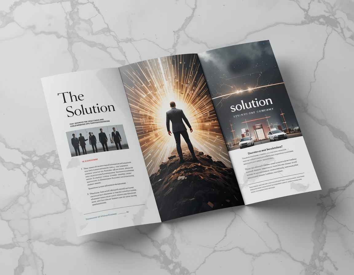
Strategic Use of Images and Visual Hierarchy
The human brain processes images 60,000 times faster than text. Your visuals should:
- Show real people experiencing the benefits of your product/service
- Demonstrate before/after scenarios when possible
- Include captions (they’re read up to 300% more than body copy)
- Create a clear path for the eye to follow
Remember: amateur brochures show products; professional brochures show transformation.
Persuasive Testimonials and Social Proof
Nothing builds credibility faster than letting satisfied customers speak for you. Effective testimonials:
- Address specific results and benefits
- Come from identifiable sources (name, company, location)
- Include photos when possible
- Speak to different customer concerns
Pro tip: Frame testimonials as mini-stories rather than generic praise. “After struggling with inconsistent branding for years, ABC Company helped us create materials that finally communicate our premium positioning. Sales conversations now start at a completely different level.”
Clear and Compelling Calls-to-Action
Every brochure needs a clear next step. What exactly do you want readers to do after engaging with your content?
- Call a specific number?
- Visit a dedicated landing page?
- Bring the brochure to an appointment?
- Scan a QR code for additional resources?
Make this action obvious, easy, and irresistible. Consider adding an expiration date or limited-time offer to create urgency.
Quality Paper and Finishes That Signal Value
The physical qualities of your brochure send powerful subconscious messages about your brand. Consider:
- Paper weight and texture
- Special finishes (spot UV, foil stamping, embossing)
- Unique folds or die-cuts
- Overall size and format
When someone holds your brochure, they’re literally feeling your brand. What sensory experience are you creating?
Common Brochure Mistakes That Lead to the Trash Bin
Even beautiful brochures fail when they make these critical errors:
Overwhelming Text Density
Dense walls of text signal “difficult to read” and trigger immediate disengagement. Break up content with subheads, bullets, callouts, and generous white space.
Confusing Navigation
Readers should never wonder “where am I supposed to look next?” Clear visual hierarchy guides them through your content in the intended sequence.
Weak or Absent Calls-to-Action
Countless brochures present great information but leave readers wondering, “So what do I do now?” Make your desired next step crystal clear.
Poor Quality Printing
Nothing says “we cut corners” like misaligned panels, inconsistent color, or cheap paper. Your printing quality communicates volumes about how you’ll treat customers.
The Brochure Design Process – A Strategic Approach
Defining Your Objective and Audience First
Before touching design software, answer these questions:
- What specific action do we want readers to take?
- Who exactly is our primary audience?
- What stage of the buying journey are they in?
- What’s their single biggest concern or desire?
- What objections might prevent them from taking action?
Your answers will inform every subsequent design decision, creating focus and coherence.
Creating a Content Hierarchy That Guides Readers
Not all information deserves equal prominence. Prioritize content by asking:
- What must readers absolutely know?
- What would be helpful for them to know?
- What additional information might interest some readers?
Then design accordingly, with essential information receiving visual emphasis and secondary information scaled appropriately.
Designing for Multiple Reading Levels
Research shows there are three types of brochure readers:
- Skimmers (30 seconds or less)
- Browsers (1-3 minutes)
- Readers (3+ minutes)
Effective brochures serve all three by using:
- Strong headlines and subheads for skimmers
- Highlighted callouts and bullet points for browsers
- Detailed body copy for committed readers
This layered approach ensures everyone gets value, regardless of engagement level.
Testing Your Design Before Full Production
Before committing to a full print run:
- Print inexpensive prototypes
- Have team members unfamiliar with the content review
- Ask “What’s the main message?” and “What action would you take?”
- If their answers don’t align with your intentions, revise
- Consider A/B testing different covers with a small test group
A small investment in testing can save thousands in ineffective materials.
Beyond Design: Distribution Strategies That Maximize ROI
Even the most brilliant brochure fails if it doesn’t reach the right hands. Consider these distribution approaches:
Targeted Handout Techniques
Train your team to use brochures as conversation tools, not conversation replacements. The moment of delivery should include a brief overview and personalized highlight based on the prospect’s specific interests.
Digital-Physical Integration
Extend your brochure’s life by connecting it to digital experiences:
- QR codes leading to videos or additional resources
- Personalized URLs for tracking engagement
- Augmented reality features that animate static content
- Digital versions optimized for sharing and searchability
Follow-up Systems That Leverage Your Brochure
Create systems where team members reference specific brochure content in follow-up communications: “On page 3 of the brochure I shared, you’ll notice how our process directly addresses the challenge you mentioned about consistency…”
This reinforces value and encourages prospects to keep your materials for reference.
Your Brochure’s True Purpose: Starting Relationships, Not Just Sharing Information
Here’s what separates great brochures from good ones: great brochures are relationship-building tools, not just information delivery vehicles.
When designed with strategic intent, your brochure becomes a tangible ambassador for your brand – working tirelessly to move prospects toward a relationship with your business.
Remember: the measure of success isn’t how beautiful your brochure looks in your office, but how effectively it converts prospects into customers once it leaves your hands.
Ready to Create Brochures That Sell When You Can’t Be There?
The strategies shared above aren’t just nice-to-have design tips – they’re the difference between materials that generate real ROI and expensive papers that get recycled.
Your next step? Evaluate your current brochures against these criteria. How many of these elements are you currently incorporating? Where are the opportunities to transform your printed materials from expenses into investments?
Better yet, let our team of design strategists analyze your current materials and identify specific opportunities for improvement. Email us today info@dssignsandmore.com to schedule your complimentary 30-minute brochure effectiveness review.
Because the only thing worse than no brochure is one that costs you money without bringing any back.
Act now – your competitors almost certainly will.