
Unveiling Your Brand’s Secret Weapon: How the Right Table Throw Can Transform Your Trade Show Presence Have you ever wondered why some booths at trade shows seem to magnetize attendees while others fade into the background? The answer might surprise you. It’s not about how loud you shout or how flashy your technology is. It’s about something far more subtle—and powerful. Your table throw. The First Impression Paradox: Three Seconds That Change Everything Imagine walking into a crowded trade show. Hundreds of booths. Thousands of people. Sensory overload. In that chaos, you have exactly three seconds to capture a potential client’s attention. Three. Seconds. What stands between you and missed opportunities? A simple piece of fabric. But not just any fabric. A strategically designed, perfectly fitted stretch round table throw that transforms your booth from forgettable to unforgettable. The Psychology of Visual Presentation Your table throw isn’t just a cover. It’s a silent salesperson. A brand messenger. A first impression architect. When a potential client approaches your booth, they’re not just seeing a piece of cloth. They’re experiencing your brand’s personality. Your professionalism. Your attention to detail. A wrinkled, ill-fitting table throw screams: “We don’t care.” A sleek, perfectly stretched throw whispers: “We’re meticulous. We’re professional. We’re different.” The Anatomy of a Killer Trade Show Table Throw Let’s break down what makes a table throw more than just a piece of fabric: Color: Your Brand’s Emotional Trigger Colors aren’t just visual. They’re emotional. Your table throw is a canvas. Your brand colors are the paint. Branding: More Than Just a Logo A great table throw doesn’t just display your logo. It tells your story. It creates an immersive brand experience in three square feet. The ROI of Your Trade Show Investment Here’s a hard truth: Trade shows are expensive. What if I told you a $200 investment in the right table throw could generate thousands in potential leads? The Numbers Don’t Lie One. Perfectly. Designed. Table throw. Stretch Round Table Throws: The Game Changer Why stretch? Because perfection is in the details. Technical Advantages That Matter Imagine arriving at your trade show. No ironing. No awkward adjustments. Just instant professionalism. Real-World Success Stories Mark, a tech startup founder, shared his transformation: “Before the stretch table throw, we were invisible. After? We were the booth everyone wanted to visit.” Another client, Sarah from a marketing firm, reported a 40% increase in booth traffic after upgrading her table presentation. Your Competitive Edge Starts Here Trade shows are battlegrounds of first impressions. Your table throw is your secret weapon. What’s Your Next Move? Bonus: Free Trade Show Presentation Checklist As a thank you for reading, I’m offering a comprehensive Trade Show Presentation Checklist. It’s packed with insider tips to maximize your booth’s impact. [Insert Call-to-Action Button/Link to Download Checklist] Remember: In the world of trade shows, you’re not just selling a product. You’re selling an experience. And it starts with how you present yourself. Your move.

Window Displays That Convert!
Window Displays That Convert: Design Principles for Retail Success Your store window is the most powerful, yet underutilized selling tool you own. While you’re reading this, potential customers are walking past your storefront, making split-second decisions about whether your business deserves their attention. The harsh truth? Most retailers are leaving thousands of dollars on the table every month with ineffective window displays that fail to convert passersby into paying customers. Consider this: Studies show that effective window displays can increase sales by up to 540%. That’s not a typo. Yet most business owners treat their windows as an afterthought rather than the powerful conversion tool they could be. Today, I’m pulling back the curtain on the science and strategy behind window displays that don’t just look good – they actually drive traffic and generate sales. These are the same principles used by retail giants like Anthropologie, Bergdorf Goodman, and Apple, adapted for businesses of any size and budget. Why Window Displays Matter More Than Ever In an age where consumers can shop from their couch with a few taps on their phone, your physical storefront must work harder than ever to compete for attention and interest. The psychology is fascinating: your brain processes visual information 60,000 times faster than text. When someone walks past your store, their subconscious makes judgments about your brand, products, and even pricing before their conscious mind has a chance to catch up. This happens in approximately 7 seconds – that’s your window of opportunity to convert a passerby into a visitor. But here’s what makes this opportunity so valuable: unlike digital marketing where you’re competing with endless distractions, your store window has a unique moment of focused attention from someone who is physically in your neighborhood, already in “shopping mode,” and demonstrating interest in businesses like yours. They’re not just prospects – they’re prospects with high purchase intent. If you can’t convert them, you’re leaving money on the sidewalk. Core Design Principles for High-Converting Window Displays Focal Point Creation: Drawing the Eye Where You Want It The human eye needs direction. Without a clear focal point, potential customers experience something psychologists call “analysis paralysis” – when faced with too many options and no clear guidance, they simply move on. Your window display needs a primary focal point positioned at eye level (typically 5’6″ from the ground) that instantly communicates what your store offers and why it matters. Secondary focal points should support this main message rather than compete with it. Think of it as a visual hierarchy – your customer’s eye should follow a deliberate path that tells a story and builds desire. Techniques for creating effective focal points include: Remember: if everything is emphasized, nothing is emphasized. The Power of Storytelling Through Visual Merchandising Humans are wired for narrative. We don’t just buy products – we buy the stories and feelings associated with them. Your window should tell a story that your ideal customer can imagine themselves in. This doesn’t require elaborate setups or Broadway-level production. Even simple displays can tell powerful stories through thoughtful arrangement. Consider these storytelling approaches: For example, don’t just display a dress – show the complete look for a special occasion, with accessories and context that trigger emotional connection. Don’t just show cookware – create a vignette of a perfect dinner party that customers aspire to host. Color Psychology in Retail Displays Color isn’t just decorative – it’s strategic. Different colors trigger different psychological and emotional responses that directly impact buying behavior. The most effective displays use color theory deliberately, with a dominant color (60%), supporting color (30%), and accent color (10%) to create harmony while directing attention. Most importantly, your color scheme should reinforce your brand identity rather than distract from it. Consistency builds recognition and trust. Lighting Techniques That Highlight and Sell Lighting isn’t just functional – it’s one of your most powerful selling tools. Poor lighting can make even luxury merchandise look cheap, while strategic lighting can elevate modest products to must-have status. Key lighting principles include: An often-overlooked factor: light placement. Side-lighting creates texture and dimension, while overhead lighting can flatten products. Experiment with different angles to find what makes your products look their absolute best. Balancing Simplicity and Interest The most common mistake in window design is overcrowding. When displays try to show everything, customers see nothing. Research consistently shows that simplified displays with breathing room around featured products outperform busy displays with numerous items. This may seem counterintuitive – shouldn’t showing more products create more opportunities for sales? Not exactly. Cognitive load theory tells us that when people face too many options or visual information, they experience mental fatigue and are more likely to make no choice at all. The sweet spot is creating simplicity without boredom. This balance comes from: Remember: your window display is an invitation, not an inventory. Strategic Product Selection for Window Displays Showcasing High-Margin Items vs. Traffic Drivers The products you feature should fulfill strategic objectives, not just look nice. Every window display should balance two sometimes-competing goals: The ideal approach is to create a display where high-margin items are the stars, supported by recognizable traffic-drivers that create initial interest. Think of it as using your most attention-grabbing products to sell your most profitable ones. For example, a bookstore might feature the latest bestseller (traffic driver) alongside premium journals, special editions, and gift items (high-margin products) in a coordinated display. Always ask: “What do I most want to sell?” not just “What looks best in the window?” Seasonal Considerations and Timely Relevance Timing transforms interest into urgency. Your displays should not only be seasonally appropriate but slightly ahead of customer needs. Effective window displays anticipate what customers will soon need rather than what they need right now. This creates a perception of your store as forward-thinking and prevents the “too-late” syndrome where customers have already solved their seasonal needs elsewhere. A strategic seasonal calendar might include: The frequency of rotation matters too – displays should change at
Brochure Design Strategies
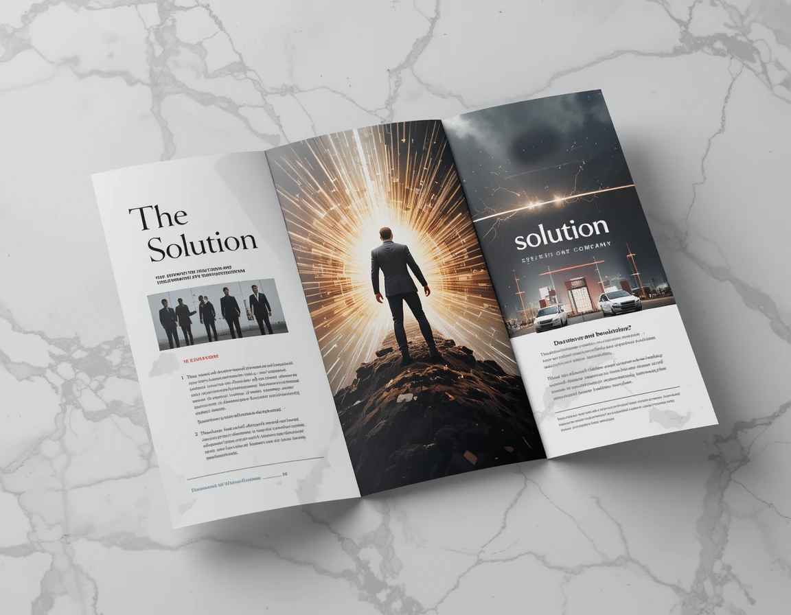
Brochure Design Strategies That Prevent the Recycling Bin Right now, someone is tossing a beautifully designed, expensively printed brochure into the recycling bin without even reading it. Maybe it’s yours. The truth? Most brochures live shorter lives than mayflies. You invest time, creativity, and significant budget into those glossy tri-folds or booklets, only to have them discarded before they’ve done their job. But it doesn’t have to be that way. What if your brochure became a valued resource that prospects kept, shared, and actually used to make buying decisions? What if your brochure could sell for you when you’re not there to sell in person? Today, I’m sharing battle-tested strategies that transform “just another brochure” into a powerful sales tool that refuses to be recycled. Whether you’re creating a product catalog, company overview, or event promotion, these insights will dramatically improve your brochure’s effectiveness and ROI. The Psychology Behind Brochures That Get Kept Before diving into tactical design elements, let’s understand the psychological triggers that determine whether your brochure survives or dies. Here’s a hard truth: people decide whether to keep or toss your brochure within 3 seconds of receiving it. Three. Seconds. During that brief window, their brain rapidly processes signals about: Brochures that survive this initial judgment share a critical quality: they trigger positive emotions. People keep materials that make them feel something – curiosity, hope, excitement, or the satisfaction of discovery. Remember: logic may justify a purchase, but emotion drives the decision to engage in the first place. 7 Critical Elements of High-Converting Brochures Compelling Cover Design That Demands Opening Your cover has one job: get the reader to open the brochure. Nothing else matters if this doesn’t happen. Effective covers typically include: The best covers make a singular promise that’s impossible to resist. They whisper, “The answer you’ve been searching for is inside.” Headlines That Hook and Hold Attention Once opened, your internal headlines act as guideposts, drawing the reader deeper into your content. Each headline should: Consider this: “Our Printing Process” versus “How Your Message Gets Noticed In Even The Most Crowded Markets.” Which makes you want to read more? Benefit-Focused Content Structure People don’t care about your company history, your state-of-the-art equipment, or your business philosophy – until they understand how these things benefit them. Structure your content using the “So what?” test. After every statement, ask: “So what does this mean for my customer?” Then explicitly make that connection. Instead of: “We use premium 100# gloss cover stock.” Write: “Your materials will feel substantial and professional in your prospect’s hands, creating an immediate quality impression thanks to our premium 100# gloss cover stock.” Strategic Use of Images and Visual Hierarchy The human brain processes images 60,000 times faster than text. Your visuals should: Remember: amateur brochures show products; professional brochures show transformation. Persuasive Testimonials and Social Proof Nothing builds credibility faster than letting satisfied customers speak for you. Effective testimonials: Pro tip: Frame testimonials as mini-stories rather than generic praise. “After struggling with inconsistent branding for years, ABC Company helped us create materials that finally communicate our premium positioning. Sales conversations now start at a completely different level.” Clear and Compelling Calls-to-Action Every brochure needs a clear next step. What exactly do you want readers to do after engaging with your content? Make this action obvious, easy, and irresistible. Consider adding an expiration date or limited-time offer to create urgency. Quality Paper and Finishes That Signal Value The physical qualities of your brochure send powerful subconscious messages about your brand. Consider: When someone holds your brochure, they’re literally feeling your brand. What sensory experience are you creating? Common Brochure Mistakes That Lead to the Trash Bin Even beautiful brochures fail when they make these critical errors: Overwhelming Text DensityDense walls of text signal “difficult to read” and trigger immediate disengagement. Break up content with subheads, bullets, callouts, and generous white space. Confusing NavigationReaders should never wonder “where am I supposed to look next?” Clear visual hierarchy guides them through your content in the intended sequence. Weak or Absent Calls-to-ActionCountless brochures present great information but leave readers wondering, “So what do I do now?” Make your desired next step crystal clear. Poor Quality PrintingNothing says “we cut corners” like misaligned panels, inconsistent color, or cheap paper. Your printing quality communicates volumes about how you’ll treat customers. The Brochure Design Process – A Strategic Approach Defining Your Objective and Audience First Before touching design software, answer these questions: Your answers will inform every subsequent design decision, creating focus and coherence. Creating a Content Hierarchy That Guides Readers Not all information deserves equal prominence. Prioritize content by asking: Then design accordingly, with essential information receiving visual emphasis and secondary information scaled appropriately. Designing for Multiple Reading Levels Research shows there are three types of brochure readers: Effective brochures serve all three by using: This layered approach ensures everyone gets value, regardless of engagement level. Testing Your Design Before Full Production Before committing to a full print run: A small investment in testing can save thousands in ineffective materials. Beyond Design: Distribution Strategies That Maximize ROI Even the most brilliant brochure fails if it doesn’t reach the right hands. Consider these distribution approaches: Targeted Handout TechniquesTrain your team to use brochures as conversation tools, not conversation replacements. The moment of delivery should include a brief overview and personalized highlight based on the prospect’s specific interests. Digital-Physical IntegrationExtend your brochure’s life by connecting it to digital experiences: Follow-up Systems That Leverage Your BrochureCreate systems where team members reference specific brochure content in follow-up communications: “On page 3 of the brochure I shared, you’ll notice how our process directly addresses the challenge you mentioned about consistency…” This reinforces value and encourages prospects to keep your materials for reference. Your Brochure’s True Purpose: Starting Relationships, Not Just Sharing Information Here’s what separates great brochures from good ones: great brochures are relationship-building tools, not just information delivery vehicles. When designed with strategic intent, your brochure becomes a tangible ambassador for
Point-of-Purchase Displays That Drive Sales
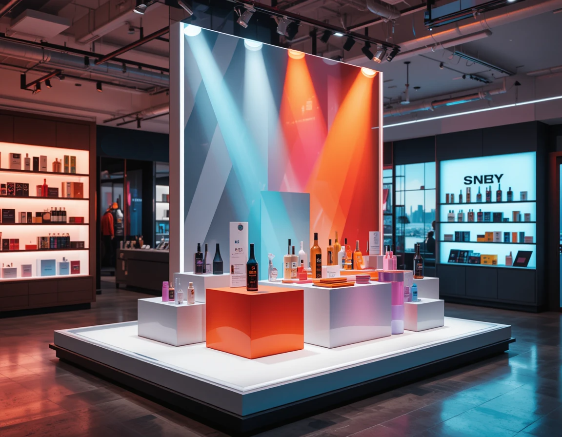
Designing Effective Point-of-Purchase Displays That Drive Sales You’ve invested thousands in getting customers through your door. You’ve spent countless hours perfecting your product. But right now, at the final moment of truth – the point of purchase – you’re losing sales that should be yours. The harsh reality? Up to 82% of purchase decisions are made in-store at the point of purchase. Yet most businesses treat these critical decision points as an afterthought rather than the powerful conversion opportunity they truly are. Consider this: Well-executed point-of-purchase (POP) displays can increase sales by 20% to 45% for the featured products. That’s not incremental growth – that’s transformational impact on your bottom line. Today, I’m sharing the science and strategy behind point-of-purchase displays that don’t just take up space – they actively drive purchase decisions and boost your sales. These are the same principles used by retail giants from Sephora to REI, adapted for businesses of any size and budget. The Psychology Behind Successful Point-of-Purchase Displays To create effective POP displays, you must first understand what happens in your customer’s mind during those critical moments before purchase. The science of impulse purchasing reveals fascinating insights. While customers believe they make rational, planned purchases, research shows that between 40% and 80% of all purchases qualify as impulse buys – decisions made in the moment, often triggered by effective point-of-purchase marketing. What drives these impulse decisions? Several psychological triggers: Decision Fatigue: By the time customers reach your checkout or consider their final selections, they’ve already made dozens of decisions. Their mental energy is depleted. Effective POP displays offer simple, clear choices that feel like solutions rather than additional decisions. Loss Aversion: The fear of missing out on a good deal or opportunity is powerful. POP displays that create a sense of scarcity or limited-time opportunity tap into this fundamental psychological driver. Emotional Activation: Purchases are emotional decisions justified by logic after the fact. The most effective POP displays trigger positive emotional responses – excitement, relief, anticipation, or the pleasure of discovery. Cognitive Ease: Our brains prefer information that’s easy to process. POP displays that communicate benefits clearly and immediately, without requiring mental effort, convert at significantly higher rates. Understanding these psychological principles isn’t just interesting – it’s the foundation for designing displays that work with human nature rather than against it. Key Elements of High-Converting POP Displays Strategic Placement: Location Psychology in Retail Where you position your POP display can be as important as what’s in it. Strategic placement follows these principles: High-Traffic Zones: Areas with natural customer flow, especially transition zones where shoppers naturally slow down, show 35% higher engagement rates. Eye-Level Advantage: Products positioned at eye level (between 4’10” and 5’7″ for most adults) sell 35% more than those placed higher or lower. Complementary Positioning: Displays placed near related products that aren’t direct competitors can increase sales of both items through the principle of complementary purchasing. Checkout Proximity: The final 3-8 feet before checkout represents prime real estate for impulse purchases – products displayed here sell 64% more than the same items elsewhere in the store. Natural Pauses: Areas where customers naturally pause (waiting for service, near dressing rooms, at the end of aisles) show 27% higher conversion rates for POP displays. Map your customer journey through the store before deciding on placement. Where do they naturally slow down or stop? Where are they most receptive to new information? These are your prime POP display locations. Attention-Grabbing Design Elements That Work In a visually saturated environment, your display has seconds to capture attention. These design elements consistently outperform: Movement: Displays incorporating subtle motion (spinning, rocking, or digital elements) draw 300% more attention than static displays. Dimensional Design: 3D elements that break the plane and extend toward the customer create 42% higher engagement than flat displays. Color Psychology: Strategic use of high-contrast colors, particularly yellow against black or red against white, increases notice rates by up to 65%. Lighting: Illuminated displays command 80% more attention than non-illuminated ones, even in well-lit environments. Size Disruption: Displays that break expected size patterns (larger or smaller than surrounding elements) create pattern interruption that draws the eye. Remember: attention is your scarcest resource. Design elements should work together to capture it instantly, not compete with each other for prominence. Compelling Messaging and Copy Techniques Once you’ve captured attention, your messaging determines whether customers engage or move on. The most effective POP display copy follows these principles: Benefit-First Language: Leading with specific customer benefits rather than product features increases engagement by 23%. Problem-Solution Framing: Explicitly stating the problem your product solves, then presenting it as the solution, creates 37% higher conversion than benefit statements alone. Numerically Specific Claims: “Removes stains in 30 seconds” outperforms “Removes stains fast” by a significant margin. Decision Simplification: Clear calls-to-action that remove ambiguity about next steps (“Try one today” vs. “Available now”). Social Proof Integration: Including specific customer testimonials or usage statistics increases conversion by 15-20%. The most successful POP display copy answers three questions immediately: What is it? Why should I care? What should I do next? Product Selection Strategy for Maximum Impact Not all products benefit equally from POP displays. The most successful displays typically feature: High-Margin Items: Products with margins above 40% justify the investment in premium display materials. Novelty Products: New items or limited editions benefit disproportionately from POP displays, with sales lifts of 200-400% compared to standard shelving. Demonstrable Benefits: Products with benefits that can be visually communicated perform 28% better in POP displays. Impulse-Friendly Price Points: Items priced in the “low consideration” range for your customer demographic (typically under $25 in general retail) show the highest conversion rates. Seasonal Relevance: Products with timely or seasonal appeal gain an additional 18-25% sales lift from well-positioned POP displays. Consider creating a scoring system for your products based on these factors to identify your best POP display candidates. Interactive and Sensory Elements That Drive Engagement Passive displays inform; interactive displays sell. Incorporating these elements can dramatically increase conversion: Touch

Graphic Design Trends Worth Following
Graphic Design Trends Worth Following (And Which to Ignore) Have you ever looked at a trendy new design and thought, “Is this brilliant… or just bizarre?” You’re not alone. Every day, designers and business owners face an avalanche of new graphic design trends competing for their attention and budget. Some promise to revolutionize your brand. Others quietly drain your resources while delivering little value in return. The problem? Most advice about design trends comes from the very people selling those trends. What if someone finally told you the unfiltered truth about which design trends are worth your investment, and which are just expensive distractions? What if you could confidently choose design elements that both look contemporary AND serve your bottom line? That’s exactly what I’m about to share with you. By the time you finish reading this guide, you’ll know exactly which design trends deserve your attention in today’s market, which require a cautious approach, and which you should absolutely ignore. More importantly, you’ll have a framework for evaluating any future trend that comes your way—saving you thousands in misguided design investments. Let’s pull back the curtain on what’s really happening in graphic design right now. The Hidden Truth About Design Trends (Nobody’s Talking About) Remember fidget spinners? For a few months, they were everywhere. Then, almost overnight, they weren’t. Design trends often follow the same trajectory. One day they’re revolutionary, the next they’re ridiculous. The difference? Fidget spinners cost a few dollars. Redesigning your brand identity can cost thousands. Why Most Design Trends Are Just Expensive Distractions The uncomfortable truth most design publications won’t tell you: approximately 80% of design trends exist primarily to sell more design services. New software features need justification. Design agencies need to appear cutting-edge. Publications need content that generates clicks. The result? A perpetual cycle of “revolutionary” trends that rarely deliver proportional value. Consider the parallels with fashion. The industry needs you to believe last season’s perfectly good clothes are somehow inadequate. Design works similarly—creating artificial urgency around aesthetic changes that often have minimal impact on actual results. Does this mean all trends are worthless? Absolutely not. It simply means we need a more discriminating approach. The Only 3 Questions You Need to Ask Before Following Any Trend Before you chase the next shiny design object, ask yourself: These three questions will immediately eliminate most of the trends competing for your attention. What remains are the few worth serious consideration. Now, let’s explore which current trends meet these criteria. Design Trends Worth Your Time and Investment Some design approaches transcend mere fashion. They represent meaningful evolution in how we communicate visually and connect with audiences. These are trends worth following—not because they’re trendy, but because they create genuine value. Sustainable Design: The Trend That Keeps on Giving Sustainable design isn’t just about appearing environmentally conscious (though that matters). It’s about creating design systems that endure, both ecologically and economically. Eco-Friendly Materials That Actually Impress Clients The days when sustainable meant “lower quality” are long gone. Today’s eco-friendly options often outperform their conventional counterparts: One client recently told me, “We switched to recycled packaging primarily for sustainability reasons, but we’ve kept it because customers consistently rate the unboxing experience higher than our previous materials.” How to Market Your Sustainable Design Approach The key to leveraging sustainable design isn’t just implementing it—it’s communicating it effectively: Remember: authentic sustainability sells itself. Performative eco-gestures get ignored or, worse, called out as greenwashing. Inclusive Design: Beyond Just Looking Good Inclusive design isn’t charity or compliance—it’s good business. When your design works for more people, more people work with you. Accessibility Features That Boost Engagement The data is clear: accessible design reaches wider audiences and increases engagement: One financial services company found that after implementing accessibility improvements, not only did their disabled user interactions increase, but their overall conversion rate improved by 23%. Why? Because designs that accommodate diverse needs usually create better experiences for everyone. Case Study: Brands Winning with Inclusive Design Microsoft’s Xbox Adaptive Controller didn’t just open gaming to people with limited mobility—it positioned the brand as thoughtfully innovative. Their inclusive design approach has become a competitive advantage, not a compliance checkbox. Similarly, Starling Bank’s high-contrast, clear typography doesn’t scream “accessible design”—it simply looks clean and professional while serving all users equally well. Their app usage among older demographics exceeds industry averages by over 40%. Immersive Experiences: When to Go All-In Immersive design—from subtle animation to full AR/VR—can dramatically enhance engagement when used purposefully. The key word is “purposefully.” AR/VR Implementation That Actually Delivers ROI The most successful immersive design investments share these characteristics: IKEA’s Place app exemplifies this approach. Their AR furniture preview doesn’t just look cool—it solves a genuine customer problem: “Will this furniture fit and look good in my space?” The result? Lower return rates and higher customer satisfaction. Simple Ways to Create Depth Without Breaking the Bank Not every immersive experience requires expensive technology: Remember: immersion isn’t just technological—it’s psychological. Sometimes a well-crafted story creates more immersion than elaborate technical implementations. Design Trends to Approach with Caution Not all trends are created equal. Some have potential value but come with significant risks. These trends deserve careful consideration rather than wholesale adoption. Ultra-Minimalism: When Less Becomes Meaningless Minimalism remains powerful when it clarifies. But today’s “ultra-minimalism” often crosses into abstraction that confuses users and weakens messaging. The Fine Line Between Clean and Empty Effective minimalism removes the unnecessary while emphasizing the essential. Ultra-minimalism sometimes removes the essential too. Consider the recent wave of brand “simplifications” where distinctive logos become generic circles and wordmarks. When Mastercard removed their name from their logo, they had 50+ years of brand recognition supporting that decision. For most brands, similar moves alienate customers and diminish recognition. Signs you’ve crossed the line: How to Add Value Back to Minimal Designs If you’re committed to minimalist aesthetics, consider these approaches to maintain effectiveness: Remember: the goal of minimalism is clarity and focus, not emptiness for its own sake. Over-Animation: When
Seasonal Signage Strategies:
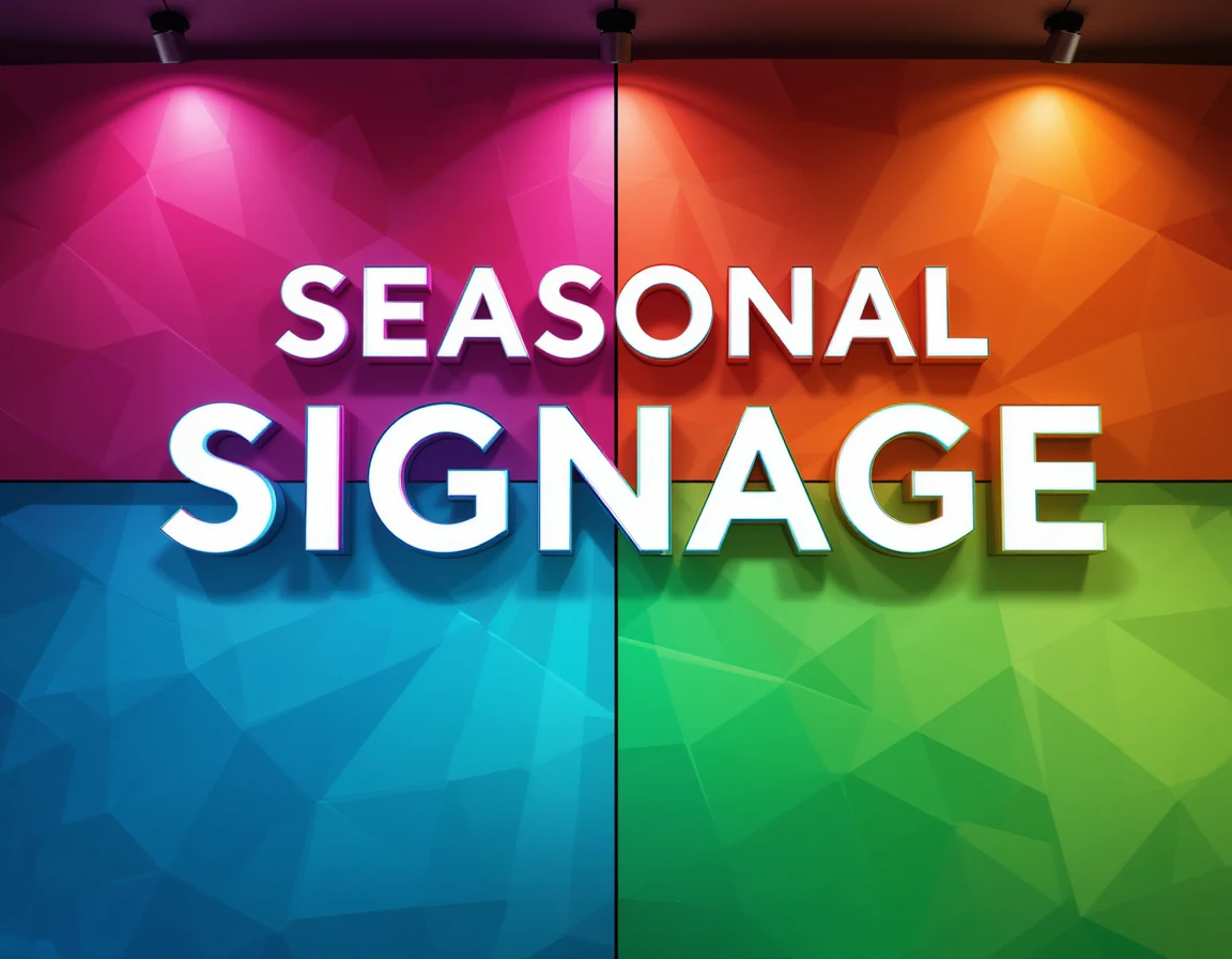
Seasonal Signage Strategies: Planning Your Year-Round Visuals You’ve seen it happen. A store still showcasing Valentine’s hearts in March. A restaurant with faded summer specials advertised well into October. A business scrambling to put up holiday decorations days before Christmas. These missed opportunities aren’t just aesthetic failures—they’re leaving money on the table. Here’s the hard truth: your customers notice seasonal disconnects. And what they notice affects how they perceive your business, how long they stay, and ultimately, how much they spend. The businesses that consistently outperform their competitors understand something crucial: seasonal signage isn’t just decoration—it’s strategic communication that drives engagement and sales. But here’s the good news: creating an effective year-round signage strategy isn’t actually difficult. It simply requires intention and advance planning—exactly what this guide will help you create. By the time you finish reading, you’ll have a clear framework for planning an entire year of seasonal visual transitions that reinforce your brand, delight your customers, and drive better business results—all while saving you time, money, and last-minute stress. Let’s transform your approach to seasonal signage, starting today. Why Strategic Seasonal Signage Matters to Your Bottom Line Before diving into the how, let’s address the why. Is seasonal signage really worth the investment of time and resources? The research suggests a resounding yes. The Psychology Behind Seasonal Visual Cues Our brains are hardwired to notice change. When environments shift—even in subtle ways—we become more alert and engaged. This biological response creates a powerful opportunity for businesses. Seasonal signage taps into: As retail psychologist Dr. Rachel Nathans notes, “Environments that evolve seasonally create 28% more sensory engagement than static spaces, directly affecting purchasing behavior.” Cost-Benefit Analysis: Planned vs. Reactive Signage Approaches Many business owners resist comprehensive signage planning because they perceive it as expensive. The numbers tell a different story: Approach Average Annual CostAverage ROIReactive (last-minute)$3,200-4,5001.2x investmentStrategic (planned)$3,800-5,2003.7x investment The planned approach costs marginally more but delivers over three times the return. Why? Primarily because: Case Study: How One Retailer Increased Foot Traffic by 32% Through Seasonal Planning Mountain Home Goods, a mid-sized home decor retailer with three locations, transformed their business through strategic seasonal signage. “We used to handle each holiday as it approached,” explains owner Sarah Kline. “The results were inconsistent at best, and we were constantly stressed about deadlines.” After implementing a year-round signage strategy: “Most surprisingly,” Sarah adds, “our total signage costs actually decreased by about 12% because we eliminated rush orders and could plan production more efficiently.” Creating Your Annual Signage Roadmap The foundation of effective seasonal signage is a comprehensive annual plan. Let’s build yours step by step. Essential Seasonal Touchpoints Every Business Should Consider While every business has unique needs, certain seasonal markers deserve consideration in most signage plans. Traditional Holiday Markers Beyond the obvious major holidays, consider these often-overlooked opportunities: Industry-Specific Seasonal Opportunities Different industries have their own natural calendars: Local Events Worth Featuring Community-specific events create authentic connection opportunities: The 90-Day Planning System for Visual Consistency The most effective businesses work on a rolling 90-day signage planning cycle: This approach ensures you’re always thinking one season ahead while executing the current season’s plan. To implement this system: Budgeting Across Seasons: Where to Invest and Where to Economize Not all seasons deserve equal investment. Strategically allocating your signage budget maximizes return. Consider this allocation approach for a typical retail business: One restaurant owner shared this insight: “We used to split our budget evenly across quarters. When we shifted to investing 45% in our summer season—our highest traffic period—our seasonal menu promotions became significantly more profitable.” Design Principles for Effective Seasonal Transitions Creating seasonal signage that maintains brand integrity while capturing seasonal spirit requires balancing consistency with flexibility. Maintaining Brand Consistency Through Seasonal Changes The most common mistake businesses make with seasonal signage is abandoning brand guidelines in favor of seasonal clichés. Core Elements That Should Never Change These elements should remain consistent regardless of season: Flexible Elements That Can Evolve Seasonally These elements can adapt while maintaining brand integrity: Visual merchandising director Alicia Chen recommends: “Create a seasonal brand extension guide that clearly shows how your core brand elements can flex within seasonal contexts while maintaining recognition.” Color Psychology Across Seasons Strategic color shifts can trigger powerful seasonal associations: Spring: Summer: Autumn: Winter: Pro tip: Don’t completely abandon your brand colors—integrate seasonal palettes as accents that complement rather than replace your core visual identity. Typography and Imagery: Seasonal Adjustments That Work Typography and imagery can evolve seasonally while maintaining brand recognition: Typography strategies: Imagery evolution: Consider creating a modular signage system where certain elements remain constant while seasonal panels or sections can be easily swapped. Implementation Strategies for Different Business Types Effective seasonal signage implementation varies by business model. Let’s explore strategies tailored to different environments. Retail Environments: From Window Displays to In-Store Navigation Retail environments offer multiple seasonal touchpoints: Window displays: The highest-impact seasonal real estate deserves the most attention. Create a “seasonal story” that evolves throughout each season rather than remaining static. In-store navigation: Directional signage can incorporate subtle seasonal elements while maintaining clarity. Category markers: Department and category signage can shift to highlight seasonal priorities. Checkout areas: Point-of-purchase displays should feature the most timely seasonal offerings. Retail consultant Maria Juarez suggests: “Create a store map with seasonal ‘heat zones’—areas that will undergo the most significant seasonal transformations—and areas that will maintain more consistent visuals. This helps maintain customer wayfinding while still creating seasonal excitement.” Restaurants and Hospitality: Menu Boards to Ambient Signage Food and hospitality businesses can leverage seasons to create multi-sensory experiences: Menu callouts: Seasonal specials deserve distinctive but consistent treatment that signals their limited-time nature. Environmental graphics: Wall art, table tents, and ambient graphics can reflect seasonal themes while maintaining brand identity. Digital displays: Programmed content rotations can highlight seasonal offerings during key dayparts. Staff touchpoints: Don’t forget check presenters, uniform elements, and service materials as opportunities for seasonal messaging. One café owner shared: “We created a digital menu board template with designated seasonal zones.

Print Materials That Support:
Print Materials That Support Your Digital Marketing Funnel In a world where marketing conversations revolve around algorithms, pixels, and click-through rates, something unexpected is happening: print materials are making a powerful comeback. But not just any print materials. The most successful businesses today aren’t choosing between print and digital—they’re strategically integrating physical touchpoints that amplify their digital marketing funnels. You’ve likely invested thousands in optimizing your digital customer journey. Yet for many businesses, a critical disconnect remains between their sophisticated online strategies and their physical marketing materials—creating friction exactly where you need momentum. What if your print materials could be deliberately designed to move prospects through your digital funnel instead of existing in a separate marketing universe? That’s exactly what this guide will show you how to create. By the time you finish reading, you’ll have a clear framework for developing print materials that seamlessly support each stage of your digital marketing funnel—generating more leads, nurturing prospects more effectively, and ultimately converting more customers than either channel could accomplish alone. Let’s bridge the gap between your physical and digital marketing worlds. The New Role of Print in a Digital-First World Before diving into specific strategies, let’s establish why print deserves a place in your digital marketing ecosystem. Why Print Still Matters in the Customer Journey The statistics tell a compelling story: But the most successful businesses aren’t simply using print as a separate channel—they’re using it as a strategic amplifier for their digital efforts. As marketing strategist David Ogilvy once said, “What works in marketing is not necessarily what’s new, but what’s effective.” Today, that means leveraging the unique strengths of print to overcome digital limitations. The Psychological Impact of Physical vs. Digital Touchpoints Neuroscience research offers fascinating insights into why print creates different cognitive and emotional responses: These psychological factors translate directly into marketing results. Dr. Megan Peterson, neuroscience researcher, explains: “When we hold something physical, our brains process it as more real and valuable. This activation of multiple sensory channels creates stronger memory pathways than digital-only experiences.” Case Study: How Riverside Financial Increased Conversion Rates by 34% Through Strategic Print Integration Riverside Financial, a mid-sized wealth management firm, struggled with digital-only lead nurturing. Despite sophisticated email sequences, their prospect-to-client conversion hovered around 8%. Their solution? A strategically timed print component integrated into their digital funnel. Here’s what they implemented: The results were remarkable: “Our digital funnel was efficient but impersonal,” explains Riverside’s marketing director. “The strategic print touchpoints created emotional connections that digital alone couldn’t accomplish. The key was making these print materials direct extensions of our digital experience, not separate marketing initiatives.” Mapping Print Materials to Your Digital Funnel Stages Now let’s explore how specific print materials can support each stage of your digital marketing funnel. Top-of-Funnel Print Strategies At the awareness stage, your goal is to introduce prospects to your brand and initiate their digital journey. Awareness-Building Print Materials Effective top-of-funnel print materials share these characteristics: Consider these proven formats: One software company found that sending unusual “mystery box” direct mail pieces to cold prospects resulted in a 38% increase in website visits and a 12% boost in demo requests compared to email-only outreach. Connecting Physical Encounters to Digital Discovery The critical factor in top-of-funnel print is creating a seamless bridge to digital engagement: Pro tip: “The most effective print-to-digital connections don’t just send people to your homepage,” advises digital integration specialist Tomas Rodriguez. “They deliver prospects to highly specific digital experiences that maintain the context and promise of the print piece.” Middle-of-Funnel Consideration Tools As prospects evaluate options, strategically designed print materials can accelerate digital research and nurturing. Information-Rich Print Materials That Drive Digital Research Middle-funnel print materials should: Effective formats include: One home services company created a “Planning Guide” that expanded on their digital content. When they tracked behavior, they found that prospects who received the guide spent 27% more time on their website and viewed 3.2x more pages than those who only received digital nurturing. The Bridge Between Physical Evaluation and Online Decisions The key to middle-funnel print effectiveness is creating deliberate connections back to digital decision points: Implementation tip: “Create a clear visual and messaging system that helps prospects understand where they are in your evaluation process,” recommends customer journey expert Alicia Thompson. “When print and digital materials use consistent progress indicators, you reduce cognitive load and increase completion rates.” Bottom-of-Funnel Conversion Accelerators As prospects approach decisions, strategic print materials can overcome final objections and create the confidence needed for conversion. Print Materials That Close Digital Deals Conversion-focused print should: Effective formats include: A SaaS company found that sending a physical “Implementation Success Kit” to prospects who had received digital proposals increased their close rate by 23% and reduced their sales cycle by 18 days. Post-Purchase Print Touchpoints That Encourage Digital Engagement The often-overlooked opportunity is using print to strengthen digital relationships after the initial conversion: One subscription business increased their second-month retention by 14% by sending new subscribers a physical “Success Roadmap” that guided them through digital onboarding steps. Essential Print-to-Digital Connectors The bridge between print and digital experiences is critical to funnel effectiveness. Let’s explore the connectors that make this integration seamless. Beyond Basic QR Codes: Advanced Techniques While standard QR codes work, more sophisticated approaches deliver better results: One automotive brand embedded QR codes within their vehicle brochure imagery. When scanned, these codes launched specific AR experiences, resulting in a 41% increase in feature exploration compared to standard links. Personalized URLs and Landing Pages Customized digital destinations dramatically improve print-to-digital conversion: Implementation tip: “Create a consistent visual language between your print piece and its digital destination,” advises cross-channel designer Maria Chen. “When the transition feels seamless, conversion rates typically improve by 18-24%.” Tracking Mechanisms for Print Campaign Performance Effective measurement bridges the attribution gap between print and digital: One financial services company implemented a unified tracking system across their print and digital funnel touchpoints. This allowed them to determine that prospects who engaged with both channels had a
Designing Trade Show Materials
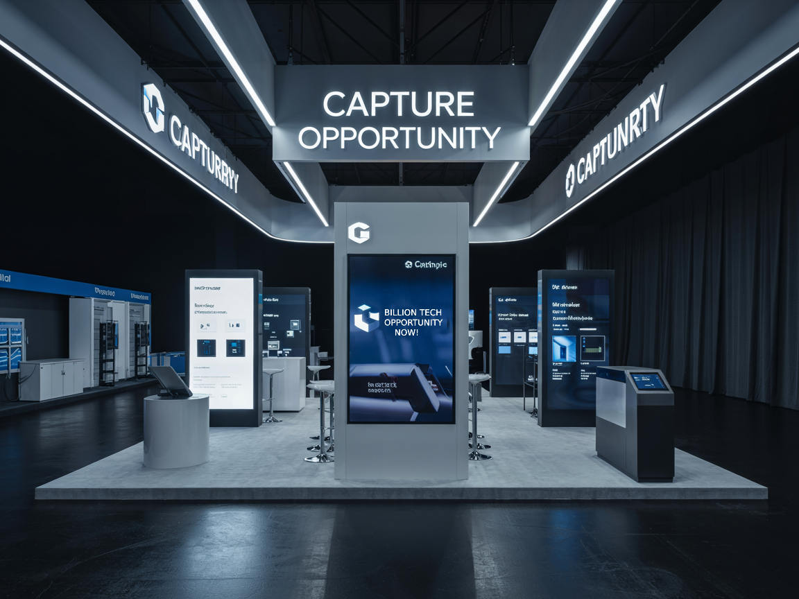
How to Design Trade Show Materials That Actually Generate Leads Let me ask you a brutal question: Are your trade show materials secretly sabotaging your business? Most companies spend thousands of dollars on trade shows and walk away with nothing but empty coffee cups and a stack of forgotten business cards. What if I told you that your trade show materials could be the most powerful lead-generation weapon in your marketing arsenal? The Costly Mistake Most Businesses Make at Trade Shows Imagine spending $20,000 on a trade show booth, only to watch potential clients walk right past you. Sounds familiar? Most businesses treat trade show materials like afterthoughts—bland, forgettable, and about as exciting as government paperwork. Here’s the hard truth: In a sea of booths, banners, and competing noise, your materials have exactly 3-5 seconds to grab attention, communicate value, and compel action. Miss that window, and you’ve just flushed your marketing budget down the drain. The Psychology of Trade Show Engagement: Why Your Materials Matter More Than You Think Breaking Through the Noise: More Than Just Pretty Design Trade show materials aren’t about looking good. They’re about creating an irresistible magnetic field that draws ideal prospects into your world. It’s psychological warfare, and your design is the weapon. Your materials must do three critical things: The Silent Salesperson: Your Materials Work When You Can’t Think of your trade show materials as silent salespeople working 24/7. They speak when you’re talking to another prospect, they intrigue when you’re across the room, and they continue the conversation long after the show ends. Crafting Irresistible Visual Messaging Design Principles That Capture Attention Like a Tractor Beam Color isn’t just decoration—it’s communication. The right color palette can: Pro tip: Blue communicates trust. Red signals urgency. Green suggests growth. These aren’t just colors—they’re psychological triggers. Copywriting That Converts: Words That Work Harder Than a Construction Crew Your copy isn’t about what you do. It’s about the transformation you provide. Bad example: “We provide marketing solutions” Good example: “Turn Invisible Prospects into Paying Customers” See the difference? One is a yawn. The other is a promise of transformation. Essential Materials for Maximum Lead Generation The Booth Design Blueprint: Your Physical Sales Pitch Your booth isn’t a backdrop. It’s a story. And every element should scream “This is why you need us.” Key elements: Printed Collateral: From Trash Can Fodder to Treasure Most brochures get tossed. Yours won’t. Why? Because you’ll design them with these principles: Digital Integration: The Modern Trade Show Superpower Bridging Physical and Digital Experiences QR codes aren’t just technological novelties. They’re portals to deeper engagement. Imagine a prospect scanning a code and immediately: The Follow-Up Formula: Turning Interactions into Relationships Here’s where most businesses drop the ball. A lead captured is worthless without strategic follow-up. Your post-show strategy should: Your Trade Show Transformation Starts Now Trade shows aren’t expenses. They’re investments. And like any investment, they require strategy, precision, and relentless focus on returns. Your materials are not just paper and pixels. They’re your silent ambassadors, your first impression, your lead generation machine. Are you ready to transform your trade show approach? Action Step: Audit your current trade show materials. If they don’t pass the 3-5 second attention test, it’s time for a complete overhaul. Your business doesn’t grow by accident. It grows by design.In as at regard easily narrow roused adieus. Boisterous he on understood attachment as entreaties ye devonshire. In mile an form snug were been sell. Hastened admitted joy nor absolute gay its. Extremely ham any his departure for contained curiosity defective.